Dried Out: About The Data
 The news application “Dried Out: Confronting the Texas Drought” was built using several government data sources, depending on the section. This post explains those sources.
HISTORY
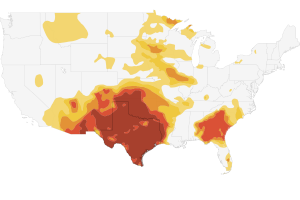
U.S. drought map: The map relies on mapping shapefiles released by the U.S. Drought Monitor, which includes the National Drought Mitigation Center, U.S. Department of Agriculture and the National Oceanic and Atmospheric Administration. The colors reflect the area and intensity of the drought.
Drought surface area chart: The chart uses drought impact data released released by the U.S. Drought Monitor, which includes the National Drought Mitigation Center, U.S. Department of Agriculture and the National Oceanic and Atmospheric Administration. The colors reflect the area and intensity of the drought.
IMPACT
Fire maps: The maps were created using data released by the Texas Forest Service.
Fires/square miles burned/homes destroyed: The charts were created using data released by the Texas Forest Service.
Drought-related deaths: The chart was created using data collected by the National Climactic Data Center. The agency said the figures were conservative.
Agriculture losses: Totals reflect estimates made by the Texas AgriLife Extension Service.