Find Out Where You Are In The 99 Percent

Todd Blaisdell / Flickr
The Occupy movement has popularized the notion of "the 99 percent." An interactive map breaks that figure down further
If you move past the front-page headlines, work your way past the daily business news, and descend into the depths of the New York Times website, there’s a reasonable chance you’ll encounter a cool, interactive infographic.
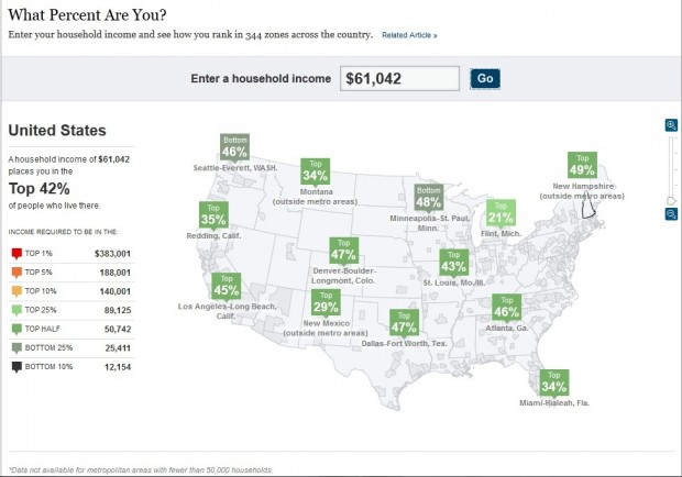
And it just so happens that today, we’ve found what we believe to be one of the Times‘ niftiest offerings to date. They’ve posted an interactive map that allows you to plug in your salary, and move your cursor over various states and counties to compare how your personal wealth (or lack thereof) stacks up. As an example, here’s a screen shot of what we found when we entered in New Hampshire’s median salary of $61,042 (which is among the highest in the country).
This map is a great tool for putting New Hampshire’s relative wealth into context. And, in the grand tradition of well-designed interactive tools, it’s just a lot of fun to play with. So if you haven’t already taken the opportunity to visit the site, it’s worth the time. Seriously. It’s right here.
